


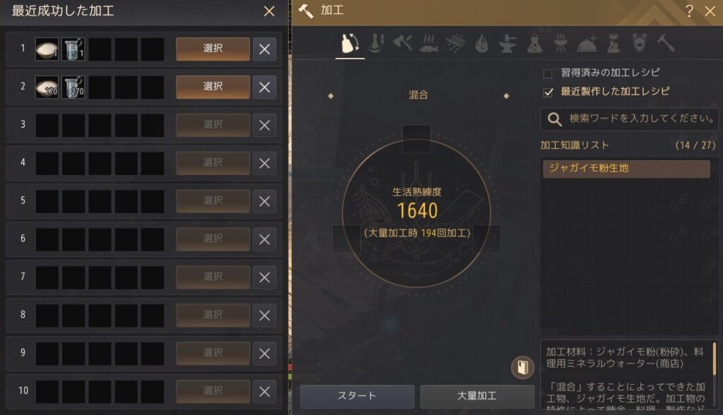
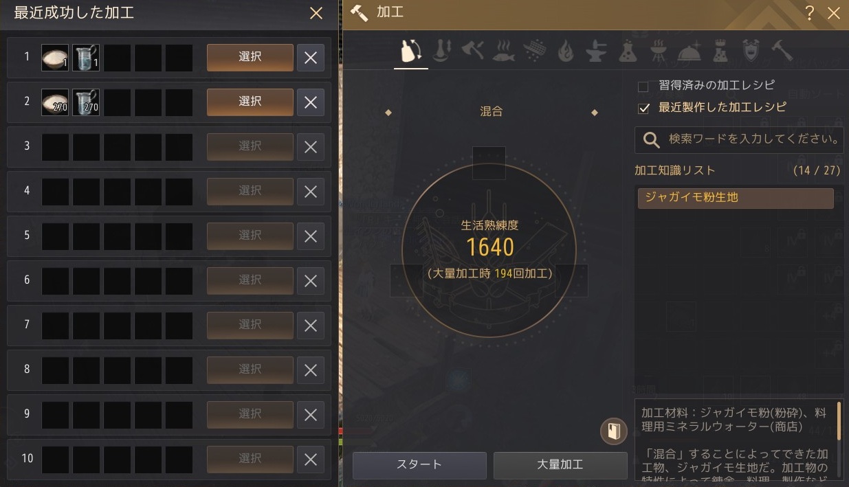
- 加工ウィンドウの利便性を高めるため、UI全体を改善
- 加工ウィンドウの下部で知識の説明をすぐに確認できるよう変更
- 「最近成功した加工」UIが改善(料理/錬金のUIが「加工」UIと同じ形に変更)
アップデートの度に何かしらUIが変わっている様な気がします。
求めているのはこういう事では無いと思いますが、利便性は上がっているはずです。
分かりやすいけど、求めている事とは方向性が違うと思います。
ぴんふ
便利だけど、こう何か違うー。
アップデートの度に何かしらUIが変わっている様な気がします。
求めているのはこういう事では無いと思いますが、利便性は上がっているはずです。
分かりやすいけど、求めている事とは方向性が違うと思います。
便利だけど、こう何か違うー。